A portal can be live, stable, and still failing. That’s the uncomfortable bit.
Most ServiceNow portals technically work, but employees avoid them. They raise requests through side channels instead, message someone in IT directly or ask HR on chat. For them keeping old spreadsheets alive feels safer than trusting the portal.
When this happens, another feature will not fix it. What helps is clarity: where the friction sits, what to fix first, and what will move the needle fastest. That is what a proper UX review uncovers, and it is exactly what strong ServiceNow portal design best practices are built to deliver.
This guide breaks down what separates a portal that simply works from one people choose, covering information architecture, search, governance, and measurement along the way.
It draws on patterns Aelum Design Studio sees repeatedly across ServiceNow best practices portal reviews for enterprise clients, and it should help you spot exactly where your own ServiceNow portal design needs attention.
A Pretty Portal Still Fails
If visual branding earns first impressions, but functional clarity earns repeat usage what will you prioritize?
A common misconception is that portal design means picking brand colors, a logo, and a homepage banner. Theming is only the visual layer of ServiceNow portal design. It matters, but it is not where adoption is won or lost.
Good design supports task completion, builds trust, and makes the right path discoverable. When an employee lands on the portal, they are there to solve a problem: reset a password, request equipment, or raise a query about their payslip.
Employees judge the portal by how easily they can complete that task instead of how polished it looks. A beautifully themed portal that buries the “raise a request” button under three menus will still frustrate users.
A well-designed ServiceNow portal reduces effort and cognitive load at every step. It should feel like the fastest way to get something done, faster than emailing a colleague or raising a support ticket manually.
Why Employees Quietly Avoid the Portal
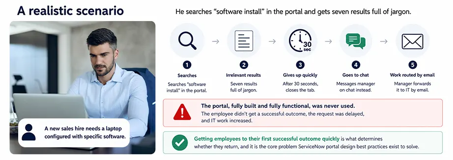
Understanding portal abandonment starts with looking at the everyday friction employees experience.
Employees cannot find the right path: Too many categories, unclear labels, or duplicate catalogue items make the starting point confusing.
Search results are weak or irrelevant: A search for “laptop” that returns unrelated policy documents teaches employees to stop trying.
Labels and categories do not match user mental models: Internal team names like “Infrastructure Requests” mean nothing to someone who just wants “a new monitor.”
Knowledge and service content feels outdated: An article referencing a tool the company retired two years ago damages trust in everything else on the portal.
First-time users do not know where to start: Without clear guidance, new employees default to whatever channel feels familiar, usually email.
ServiceNow Portal Design Best Practices That Actually Move Adoption
1. Information Architecture
Strong information architecture is one of the foundational ServiceNow best practices portal teams often underinvest in. And, strong taxonomy and navigation is the real test of information architecture: can employees find the right topic quickly, without guessing which menu it might be hiding under? If the answer is no, no amount of theming will fix adoption.
Organize around employee intent, not internal support teams: Employees think in terms of “I need a new laptop,” not “Hardware Asset Management Requests.”
Simplify categories and subcategories: A flat structure with fewer, well-labelled options usually outperforms a deep, complex hierarchy.
Use plain-language labels: Replace internal terminology with words employees would naturally use in a search.
Keep navigation consistent across pages: If categories appear in a certain order on the homepage, that order should carry through the entire experience.
Create role-based entry points when appropriate: A finance employee and a warehouse employee do not need the same top-level menu, and tailoring entry points by role can shorten the path to resolution.
2. ServiceNow Portal UX Principles
Once the architecture is right, the interface itself needs to support fast, confident action. These ServiceNow portals design principles apply across ITSM, HRSD, and any other module exposed through the portal.
Make key actions visible immediately: The most common tasks should never be hidden behind extra clicks or submenus.
Reduce clicks for top tasks: Every additional step between intent and completion increases the chance an employee gives up.
Keep layouts predictable: Consistent placement of search, navigation, and request buttons builds familiarity over time.
Use reusable design patterns: Repeating the same card layouts, form structures, and button styles reduces the learning curve for new pages.
Remove clutter that competes with the primary action: Every extra banner or decorative element pulls attention away from what the employee came to do.
Forms and request flows: The best ones are short, guided, and built with smart defaults, so employees are not re-entering information the system already knows about them.
Notifications and status: Employees should always know where things stand, without being buried in updates that add noise rather than clarity.
High-frequency employee tasks that should always be quick to access include:
- Requesting IT equipment or software
- Resetting a password or unlocking an account
- Raising an HR query or leave request
- Checking the status of an existing request
- Finding a policy document or knowledge article
Designing around these tasks first, then layering in less frequent requests, keeps the portal focused on what employees need most often.
3. Search and Self-Service
Search is not a secondary feature bolted onto the portal. It is a core UX capability, and often the single biggest driver of ServiceNow portal design best practices in action.
Search needs to surface knowledge articles, catalogue items, and request options together, ranked by relevance rather than content type alone. Employees just want the right result at the top.
Writing clearer article titles and summaries directly improves search performance. A title like “VPN Setup Guide for Remote Employees” will outperform “Network Access Procedure Document 4.2” every time.
Designing search to support ticket deflection means giving employees a genuine self-service path before they consider raising a ticket. If someone searches for “reset password” and the answer appears instantly, that is one less ticket for the service desk.
Using analytics to identify failed searches and abandoned journeys should be routine, not a one-off audit. These data points reveal exactly were content or labelling needs attention.
What High-Performing Portal Search Looks Like
- Returns relevant results within the first three entries, not buried on page two
- Blends knowledge articles, catalogue items, and FAQs in a single result set
- Uses natural language matching rather than requiring exact keyword phrasing
- Highlights top-searched terms to guide employees who are unsure what to type
- Is reviewed monthly using search analytics to catch emerging gaps
Not sure where your portal is losing employees?
Aelum Design Studio runs a quick UX review to find exactly where friction sits, and what to fix first.
4. First-Time User Experience
The first session an employee has with the portal often determines whether they become a regular user or revert to old habits.
Clear starting points matter for new employees. A homepage that shows “Get Started” style prompts helps orient someone who has never used the platform before. Showing the most common tasks first, rather than an alphabetical list of every service offered, reduces early confusion.
Using onboarding-friendly language, avoiding acronyms and internal shorthand, helps first-time users feel confident rather than lost. Anticipating questions before they arise, rather than waiting for employees to raise a ticket about how to raise a ticket, creates a helpful first impression that carries forward into long-term usage habits.
New-hire example: A new employee’s first portal visit could be shaped around a simple checklist: set up your laptop, request building access, complete HR paperwork, and find your team’s knowledge base. Presenting these as a short, guided list on day one, rather than expecting discovery, meaningfully improves early adoption.
5. Accessibility and Usability
Designing for all employees is a core part of ServiceNow portal design best practices instead of optional, and it directly affects how many people can use the portal successfully.
Clear contrast, spacing, and visual hierarchy help every user scan the page efficiently. Keyboard navigation and screen-reader support ensure the portal works for employees using assistive technology, which is both a usability and compliance consideration.
Avoiding visual choices that reduce readability, such as low-contrast text or dense layouts, keeps the experience comfortable across devices. Testing usability with real users, not just reviewing mock-ups internally, surfaces friction that design teams often miss.
5-Point Usability Review Checklist
- Can a new user complete the top three tasks without assistance?
- Does every interactive element meet accessibility contrast standards?
- Is the portal fully navigable using only a keyboard?
- Do labels and categories make sense without internal context?
- Has the portal been tested with actual employees, not just the project team?
6. Content Hygiene and Governance
A polished portal design can still fail if the content behind it is outdated or inconsistent. Keeping knowledge and portal pages current requires a scheduled review cycle, not an occasional cleanup. Removing duplicate and stale content prevents employees from landing on conflicting instructions, and assigning content ownership means every article and catalogue item has a named owner responsible for accuracy.
Reviewing high-traffic content regularly ensures the pages employees rely on most are also the most carefully maintained. Treating portal maintenance as an ongoing operating process, rather than a one-time project deliverable, separates portals that stay useful from portals that slowly decay after go-live.
Governance workflow example: A quarterly review cycle where content owners receive a report of their assigned articles, flagged by last-updated date and view count. Owners confirm accuracy or update the content within a set window, and anything unconfirmed after two cycles gets escalated for retirement or rewrite.
7. Measuring Portal Success
Measuring whether a portal is genuinely improving employee experience requires looking beyond simple login counts.
Adoption and usage trends show whether employees are returning overtime and visiting once out of curiosity. Search success rate reveals whether employees are finding what they need or giving up partway through. Knowledge engagement metrics indicate whether articles are being read and used to resolve issues independently.
Ticket deflection indicators show how much self-service is genuinely reducing service desk volume, and drop-off points in key journeys highlight exactly where employees abandon a task. Using this data to prioritize redesign efforts ensures improvement of work is guided by evidence rather than assumption.
| Metric | Why It Matters | Target Signal |
| Portal adoption rate | Shows whether employees are choosing the portal over other channels | Steady month-over-month growth |
| Search success rate | Indicates whether employees find answers without escalating | Majority of searches end in a click-through, not abandonment |
| Knowledge article engagement | Reflects whether content is trusted and useful | High views paired with low related-ticket volume |
| Ticket deflection rate | Measures real self-service impact on service desk load | Noticeable reduction in tickets for high-traffic topics |
| Task completion / drop-off rate | Reveals friction in key employee journeys | Low abandonment before task completion |
Turn Your ServiceNow Portal into an Unbeatable Moat
A better ServiceNow portal is not about adding more widgets or redesigning the homepage. It is about creating an experience employee choose to use.
- Review Your Current Portal Experience: Identify navigation gaps, weak search journeys, outdated content, and onboarding friction that may be quietly driving employees back to email and chat.
- Explore Aelum Design Studio: Learn how Aelum combines design thinking, usability testing, information architecture, and ServiceNow expertise to build people-friendly digital experiences.
- Read our Employee Experience insights: Understand why portal adoption is a behavioural challenge, not just a design challenge, and what high-performing ServiceNow organizations do differently.
- Talk to an Aelum consultant: If you are planning a new ServiceNow portal, redesigning an existing one, or trying to improve self-service adoption, start the conversation with our UX and ServiceNow specialists.